BIRD CORP

User Testing for Prototype

After completing the prototype, I playtested the game myself and discovered flaws I hadn’t noticed during development, primarily the lack of clear directions and confusion around the controls.

Since the interaction controls (interact/travel) weren’t displayed in-game, I added control instructions beneath the game export on the devlog site as a temporary solution.

control instructions under game

For the next iteration, I plan to implement the tasks UI and display the E-to-interact prompt directly in the game, providing clearer in-game feedback and ensuring smoother gameplay.


Key Takeaways

Critical Discovery: Controls that seem obvious during development become confusing in fresh playthroughs
Temporary Solution: Added control instructions on website as stopgap measure
Next Priority: In-game "E to interact" prompts and tasks UI
User Testing Value: Running unbiased test passes reveals issues you cannot see during active development

Implementing a Tutorial System

Addressing User Feedback

Following my latest test pass and academic review, one of the most critical improvements needed is a tutorial system. The interaction flow was unclear, particularly how to access the minigame from the desk.

"It's not totally clear how to get to minigame from the desk. A prompt to press 'E', or to 'try talking' would work!"
— Design review note

Planned Implementation

1. Visual Interaction Prompts

I will implement floating “Press E” indicators that appear above interactable objects and NPCs on approach. This follows established UX conventions in games like Stardew Valley and Undertale.

Technical Approach:

  • Create an InteractionPrompt node as a child of interactable objects
  • Use Area2D collision detection to show/hide prompts based on proximity
  • Animate the prompt with a subtle bounce to draw attention

2. First-Time Guidance

For first-time runs, I will implement contextual tooltips that appear during the first few minutes of gameplay:

TriggerTooltip Message
Game start”Use WASD or Arrow Keys to move”
Near first NPC”Press E to talk to colleagues”
Near desk”Press E to start your work tasks”
First minigameBrief overlay explaining drag-and-drop mechanics

3. Optional Help Menu

A help menu accessible via the pause screen will provide a controls reference for quick reminders without interrupting gameplay flow.

Design Philosophy

Following the “failing forward” approach established in my game design philosophy, these tutorials will be:

  • Non-intrusive: Prompts fade after first use
  • Contextual: Appear only when relevant
  • Optional: Hints can be skipped or disabled

This implementation addresses the accessibility concerns while maintaining the exploratory feel that makes Bird Corp engaging.

Critical Reflection: What Worked & What Didn't

When I began this journey in September, I wanted to create an educational game that didn’t feel like one — something that would teach about AI’s environmental impact through experience rather than lectures. My goal was to create something fun to explore while still conveying the message naturally.

Now, several months and countless late nights later, here’s what I’ve learned.


What Worked Well

The Core Mechanic: Manual vs. AI

The “choose between manual work or AI assistance” mechanic successfully embodies procedural rhetoric. By making AI the easier option with hidden consequences, the game’s rules themselves argue about convenience versus sustainability.

Observation: Playing through the game myself, I found that the AI option felt deceptively appealing — and the guilt of discovering its consequences landed exactly as intended.

Visual Design & Atmosphere

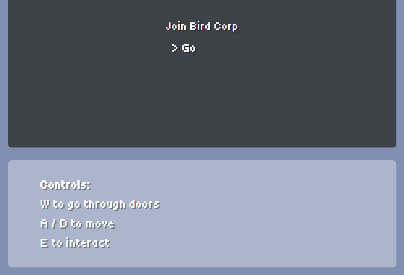
The pixel art aesthetic struck the right balance between approachability and professionalism. Stylized visuals prevented the office setting from feeling “dull or uncomfortably close to real-life work” (Risley et al., 2025).

Technical Integration

Building both the game prototype and this development log as a unified web project was ambitious, but successful. It demonstrates proficiency with Godot, Astro, React, and Tailwind while creating a cohesive portfolio piece.


What Needed Improvement

Tutorial & Onboarding

My professor noted confusion around controls and how to access minigames. As the developer, I knew the controls instinctively and failed to recognise that first-time use needed explicit guidance. Lesson: user testing early and often is crucial. I’ve documented plans for visual interaction prompts and contextual tooltips.

Environmental Theme Connection

The professor identified a gap between the environmental themes and the word-sorting minigame mechanic. I prioritised getting a working minigame over ensuring it aligned with the game’s message. Lesson: in serious games, mechanics must embody the message — technical feasibility shouldn’t override thematic alignment. A wind farm assessment minigame is planned to tie evaluation directly to environmental stakes.

Difficulty Scaling

The current minigame lacks a clear progression of challenge. I focused on getting one version working before thinking about variation and escalation. Lesson: replayability should be considered from the start. A multi-dimensional scaling approach is part of the planned work ahead.


Unexpected Challenges

The “Tutorial Loop” Frustration

I spent weeks stuck on basic Godot problems, watching the same tutorials repeatedly before solutions clicked. This cycle taught me that persistence matters more than immediate understanding, that taking breaks provides fresh perspective, and that sometimes the answer was there all along — I just wasn’t ready to see it.

The Scope Management Challenge

I initially envisioned multiple endings, complex NPC relationship systems, and elaborate basement revelations. Reality constrained these ambitions.

Key Insight: A polished, cohesive prototype is more valuable than an ambitious but incomplete project. The core mechanic matters more than feature quantity.

Critical Reflection: Feedback & Lessons Learned

How Feedback Shaped the Project

Academic Feedback

My professor’s assessment identified three critical gaps: better tutorials, stronger environmental theme connection, and clarity on difficulty scaling. Each prompted substantive design iterations over the course of the project. This validated the practice-as-research approach: external critique drives meaningful refinement.

Theoretical Framework

Applying the Triadic Model (Harteveld & Kortmann, 2009) and procedural rhetoric (Bogost, 2007) provided concrete design guidance — not just academic exercise. When making decisions, I could ask: “Does this serve Reality, Meaning, or Play? Does this mechanic argue through its rules?”


What I’m Most Proud Of

From scratch to playable

I had never shipped a game before Bird Corp.

Getting something playable out of Godot while keeping this academic log running in parallel still feels like the main win — not because the build is flawless, but because neither the game nor the log was treated as an afterthought.

Handmade visuals

Every character, tile, and animation is mine, drawn in Aseprite over long sessions.

The office reads as one place because it was never assembled from a generic asset pack: the palette and proportions were decided together, scene by scene.

This devlog as a build

The site is not an afterthought tacked onto the game.

Astro, routing, content collections, and layout sit in the same repository as the prototype. That cohesion matters to me as much as any single room in Godot.


What I Would Do Differently

Test earlier

I would run the build myself on a cold start as soon as movement and interaction felt stable.

Waiting until the first minigame felt “finished” delayed the moment I had to admit the controls were not self-explanatory. Friction shows up right away if you pretend you have never touched the project before.

Minigame before the full office

I would prove the core task and its thematic fit before investing in the wider environment.

A polished room can hide a mechanic that still does not say what the project is about. Theme and task need to fail fast together, not after the set dressing is in place.

Plan progression up front

I would sketch difficulty curves and replay hooks alongside the first playable loop.

Bolting scaling on at the end means negotiating with geometry, pacing, and UI you already locked in.

Critical Reflection: What's Next & Closing Thoughts

What’s Next

While this prototype represents the scope for this academic project, Bird Corp has potential for further development.

Near term

Implement a tutorial system with clearer prompts, add the wind farm assessment minigame, roll out difficulty scaling, and address known bugs.

Further out

Multiple endings driven by choices, a deeper NPC relationship layer, the full basement sequence, more office tasks beyond meeting notes, and a mobile-friendly build.


Reflections on Practice as Research

By making the game, I learned things no amount of reading could teach: how game engines structure logic differently than web frameworks, why pixel art animation feels fluid at certain frame rates, and the difference between designing for myself versus for an audience.

"The artefact is the research" — Through building Bird Corp, I've generated knowledge about serious game design, environmental education, and the challenges of embodying abstract concepts in interactive systems.

Final Thoughts

Bird Corp isn’t perfect. It’s a prototype with rough edges and incomplete features. But it represents genuine learning and creative growth. The core mechanic works. The art style succeeds. The theoretical framework provides genuine design guidance.

If even one person who plays this game thinks twice before automatically reaching for the “AI Assistant” button, the project has done its job.


Acknowledgments

My professorFor pushing me to strengthen the environmental connection and for thoughtful critique throughout.

The Godot communityFor forum answers and tutorials that unstuck me more times than I can count.

CoffeeFor keeping me functional during five-hour sleep nights.